Thermify Console
I led the end-to-end redesign of Thermify’s customer-facing console, creating a seamless interface for users to deploy, manage, and track computing tasks. From user flow and wireframing to final implementation, I was solely responsible for the design direction and development. The goal was to enhance usability, streamline task management, and modernise the interface, ensuring a more efficient and intuitive user experience.
Analysis
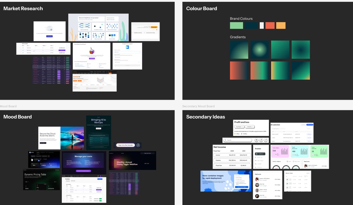
To inform the redesign, I conducted market research to analyse competitor ECS consoles and identify industry best practices. This ensured a user-centric approach, balancing functionality with intuitive design. By understanding customer expectation, I was able to create a console that felt both familiar and innovative.
Mood Board
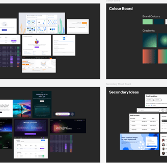
Market Research
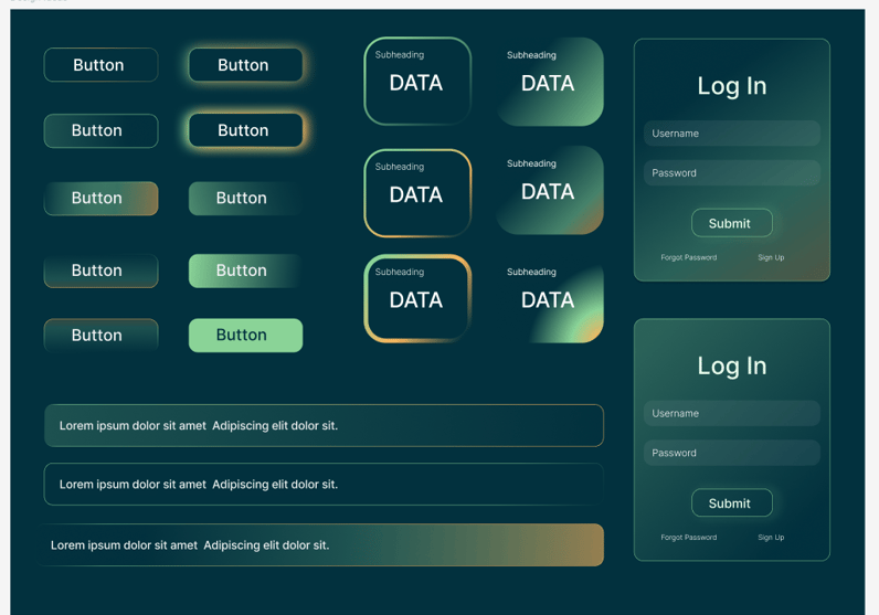
I created two moodboards to present distinct design directions to the CEO. One featured a sleek, tech-driven aesthetic with a modern glassy background, which aligned with the brand and was ultimately chosen, while the other explored a nostalgic, game-like drop-board style inspired by retro UI trends.
User Pain Points
Operational Manager
Professional and on-brand to maintain consistency with the company’s identity and to be presentable to stakeholders.
Clear navigation and intuitive structure to improve efficiency in daily operations and task management.
Modernise the console with a sleek, up-to-date design that aligns with current UI trends and user expectations.
User Research
CEO
Nothing too fancy or over-designed, ensuring a clean and straightforward user experience.
Functionality first, with a strong focus on one-click CTAs to streamline customer interactions and reduce friction.
Would like to combine all the tasks into one task log instead of seperate for previous and pending.
Lead Engineer
Prefers basic layouts, prioritising functionality over unnecessary visual elements.
A clean, structured UI that integrates seamlessly with existing workflows and minimises potential technical issues.
Implement powerful, action-driven buttons that handle complex logic behind the scenes, providing users with a seamless and efficient experience.
I conducted interviews with the team to understand their needs and expectations for the redesign. These insights helped shape a more user-focused interface that addressed key pain points.
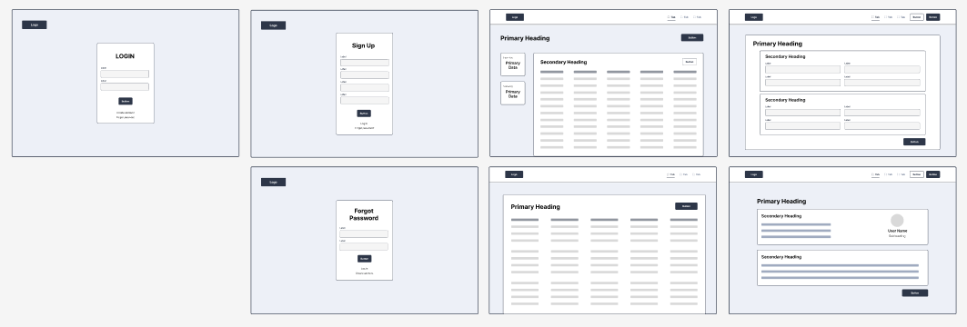
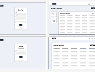
Wireframe
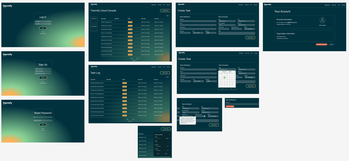
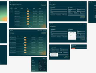
Using Figma, I created an initial wireframe that laid out the foundation for the new console, incorporating key insights from user research. The design featured a unified task log page with clear CTAs, ensuring a streamlined workflow. New additions included a user data summary displaying total spend and total hours, as well as an extra column in the task log to indicate task statuses such as "pending" or "completed." This refinement allowed all task logs to be combined into a single, organised layout, enhancing clarity and usability. I particularly enjoy piecing together the puzzle of how to improve the UI, carefully considering minimalism and functionality to ensure an intuitive and efficient user experience.
View in Figma
The Process
Review
Home Page
The team was very pleased with the new layout, feeling it was clean and intuitive.
Including the task log directly on the homepage was seen as a great idea, allowing users to access their main priority without unnecessary clicks.
The new summary features, such as total spend and total hours, were well-received for clearly communicating essential data to users.
Feedback
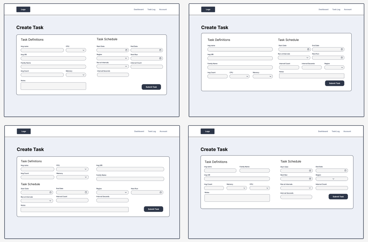
Create Task Page
The team noted that user inputs could be condensed significantly, as many fields require only short entries.
Enhance default settings for user convenience, such as setting the start date to today and the end date to one hour later.
The separation of the form into two sections—task definition and task schedule—was appreciated as it makes the form more digestible.
Overall
The project is meeting expectations, with strong CTAs and a clear focus on aligning with the user's core intentions.
The user interface is being praised for its simplicity and intuitive navigation, making the console more user-friendly.
Feedback suggested improving the layout to eliminate excessive scrolling when submitting a task, aiming for a more streamlined process. Condense where possible.
After presenting the initial wireframe, I gathered feedback from the team to ensure the design aligned with their needs and expectations. This collaborative process helped refine the interface, addressing any concerns and enhancing the overall user experience.
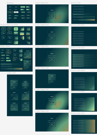
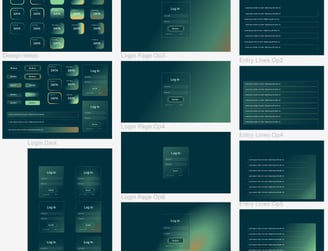
Design Ideas
The design process was influenced by the insights gained from my initial research. I experimented with the brand’s colours to create gradient backgrounds, testing how they would work within the console’s components. The challenge was to strike a balance between modern, futuristic aesthetics and the need to avoid over-designing, as requested.
One of my favourite design choices was the subtle orange glow gradient, symbolising the heat produced by their servers to warm homes—creating a visual nod to the company’s core purpose. I thoroughly enjoy the design process, especially the challenge of communicating business value through visual elements.
The Process
Final Product
Next Stages
With the first version of the application now live, the next steps involve expanding its functionality and refining the design. I plan to enhance elements like pagination and refine the accounts page to create a sleek, modern interface that aligns with the rest of the application. Additionally, I aim to introduce features that allow users to filter the view based on selected columns and implement live updates to track task statuses in real-time. Overall, the team is very pleased with the application's look and feel.